


Interior Colour Consultation In London
Choose Colours That Work in Your Actual Space.
Choosing a paint colour from a small sample card can be surprisingly difficult. The same shade can look warm in one room, cool in another, and completely different as natural light shifts throughout the day.
Oraanj provides professional colour consultation in London for homes and commercial spaces, helping you curate colours that harmonise with natural light, flooring, furniture, bespoke joinery, materials and the wider interior architecture.
Color selection interacts intimately with architectural lighting design, tactile window treatment design, and holistic residential interior decor, with optional principles from feng shui interior design.
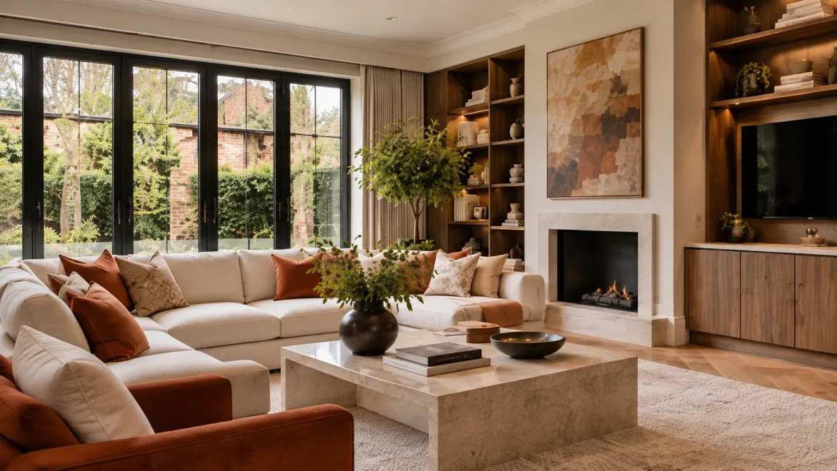

What Do You Need Help Choosing?
Move From Endless Paint Swatches to a Considered Palette
Whether decorating a single room or developing a cohesive colour scheme across a four-storey London townhouse, we guide you to confident, beautiful decisions.

Why Is Choosing the Right Paint Colour So Difficult?
Because You’re Never Choosing a Colour in Isolation
A paint swatch shows you a colour in a vacuum. It doesn’t show you how it behaves within your specific room.
The identical paint shade will look completely different depending on window orientation, daylight brightness, artificial colour temperature, flooring species, fabric reflections, and adjoining room colours.
This is why a shade that looked stunning on Pinterest or in a friend’s home can feel completely wrong on your walls. Colour consultation evaluates the shade within the total interior ecosystem.
How Does Natural Light Affect Paint Colour?
The Same Colour Looks Different in Every Direction
Natural light is the single most powerful factor governing how colour is perceived.
North-Facing Rooms: Receive cooler, bluer, indirect light all day. Cool greys and crisp whites can feel icy or dull. These spaces thrive with warm-undertone neutrals, soft blush tones, or rich, moody colours that embrace intimacy.
South-Facing Rooms: Enjoy bright, golden daylight throughout the day. Almost any colour works, but warm tones can look intensely saturated, making softer, cooler shades ideal balance partners.
East & West Aspects: Shift dramatically from warm morning sunshine to cool evening shadows, or vice-versa. We observe and test colours under all diurnal conditions.
Understanding Undertones
Why Two Similar Colours Can Feel Completely Different
Two paints can both appear “soft beige” or “dove grey” on a card and yet clash completely once applied.
The culprit is the undertone — subtle pigments of green, yellow, pink, blue or violet ground into the base. An undertone that clashes with the yellow in oak flooring, the red in mahogany or the green in garden foliage will feel jarring.
We dissect undertones across every element in the space to guarantee absolute architectural coherence between paint, stone, woodwork and textiles.
Choosing the Right White
White Isn’t Just White
Selecting white paint is often more challenging than selecting a strong colour.
There are crisp architectural whites with cool undertones, soft chalky whites with grey nuances, and rich creamy whites with ochre warmth. Brilliant white straight from the tin often looks stark and sterile in London homes.
The right white must complement the ceiling cornice, window architraves, skirting boards and natural flooring without appearing sickly yellow or uninvitingly cold.
Neutral Doesn’t Have to Mean Beige
Build a Palette With Depth & Contrast
A neutral interior should feel sophisticated, tactile and layered — never bland or safe.
We create depth by contrasting warm stone wall tones with dark architectural woodwork, textured linen curtains, wire-brushed oak, fluted glass, patinated bronze hardware, and hand-woven bouclé textiles.
The result is an interior that feels serene, calm and deeply welcoming while maintaining strong visual interest throughout the day.
Using Stronger Colours
Where Should the Colour Go?
A deep or saturated colour can utterly transform the character of a room. But the critical question is placement.
Which wall commands the eye? Should the room be “colour-drenched” with walls, skirting, doors and ceilings painted in the same deep hue? How does the view look when standing in an adjoining lighter hallway?
We consider architectural volumes, ceiling heights and sightlines so saturated colours feel intentional and breathtaking, rather than overpowering.
Colour Consultation for Living Rooms & Bedrooms
Work With the Furniture You Love
Living rooms and bedrooms require distinct emotional atmospheres tailored to relaxation and socialising.
In reception spaces, paint colours must embrace primary pieces: sofas, rugs, art and bespoke media joinery. If these items are staying, they become our guiding anchor.
In master bedrooms and guest suites, we craft soothing palettes that balance headboard fabrics, bedding, drapery and low-glare warm illumination to cultivate restful retreat.
Coordinate Colour With Fixed Finishes & Joinery
Marrying Paint With Stone, Tile & Cabinetry
Kitchens and bathrooms contain permanent elements that cannot easily be repainted.
Worktop quartzite, porcelain wall tiles, sanitaryware and brassware dictate strict colour relationships. We coordinate paint shades with cabinet spray colours, splashbacks and adjoining open-plan living areas.
For bespoke joinery — such as dressing rooms, alcove shelving or media units — paint colours can either blend into the walls for an architectural look or stand out as a bespoke furniture statement.
Whole-House Colour Schemes
Let Rooms Relate Without Making Them Identical
A whole-home palette does not mean painting every room the exact same shade.
Different spaces should have their own identity while feeling part of a singular design story. We map sightlines from entrance halls through stairways, open-plan kitchen-living zones, bedrooms and home offices.
Moving from one room to another feels natural and harmonious, creating a home that breathes seamlessly as you walk through it.
Paint Finish & Lighting Interaction
The Colour Is Only Half the Decision
The sheen level and lighting design directly dictate how a colour looks and performs.
Sheen Levels: Dead-matt finishes absorb light, masking uneven plaster and creating chalky luxury. Eggshell and satin provide durability and subtle light bounce for woodwork and joinery.
Artificial Lighting: High-CRI 2700K warm LED illumination renders warm undertones beautifully, while cool 4000K commercial LEDs can flatten domestic colours. We coordinate lighting schedules directly with your paint specification.

Should I Test Paint Samples First?
Yes — Especially Before Painting a Large Area
We strongly advocate testing large sample boards within the real physical space before committing to decorating.
Never paint test patches directly on coloured walls — the existing background will distort your perception. Instead, paint large lining paper or sample boards that can be moved around the room.
Observe the samples at breakfast, in the bright midday sun, and under low evening lamps beside your actual flooring and upholstery.
Our Colour Consultation Process
From Room Assessment to Final Paint Specification
A clear, disciplined process ensuring your colour scheme is grounded in architectural reality.
Understand the Space
We review photographs, floor plans, room usage and the atmosphere you wish to achieve.
Inventory Existing Elements
Cataloguing permanent finishes: timber flooring, stone, furniture, joinery and artwork.
Daylight & Aspect Review
Assessing window directions, shadow patterns, and artificial lighting colour temperatures.
Develop Palette & Sheens
Curating specific paint names, codes and sheen recommendations for walls, ceilings and trim.
Colour Consultation or Full Interior Design?
Which Service Level Best Matches Your Needs?
Understanding when you need targeted palette advice versus full interior transformation.
Planning a Colour Consultation in London?
Whether you’re refreshing a single room or developing a cohesive colour scheme across an entire property, we can discuss your space and guide you toward confident colour decisions.
Some of the questions we’re often asked include:
- What does an interior colour consultant do?
- Why does paint look different on the wall than on a swatch?
- Can you help with a whole-house colour scheme?
- Can you work with my existing furniture and flooring?
Tell us about your room and what you want to achieve. We’ll review your requirements and help establish the next steps.
Call us on +44 (0) 7448 803051 or complete the enquiry form to discuss your project.
Frequently Asked Questions
Start by considering the room’s natural light, window aspect, flooring, furniture, fixed finishes and adjoining spaces. Physical samples should then be reviewed within the actual room under both daytime and evening lighting before making the final decision.
Colour can appear different on the wall because of natural light, artificial lighting colour temperatures, surrounding materials, the scale of the painted surface and reflections from flooring or fabrics within the room.
Lighter colours can contribute to a brighter, more open appearance, but the perception of space is also affected by lighting, furniture scale, ceiling contrast and the wider design. Sometimes richer, cocooning tones can also add depth to smaller rooms.
Yes. Different whites carry subtle cool, warm, chalky or stony undertones and behave differently depending on the light and surrounding materials such as timber flooring, stone and woodwork.
Yes. Colour can be developed across multiple rooms so hallways, living spaces and bedrooms flow naturally into one another while allowing each space to retain its own character.
Yes. Existing sofas, rugs, curtains, timber flooring, cabinetry and artwork serve as important reference points when developing a cohesive colour palette.
Where practical, yes. Reviewing large physical sample boards within the actual room at different times of day and under evening artificial light helps confirm how a shade behaves before a full wall is painted.
Yes, depending on the agreed consultation scope. We consider appropriate sheens and finishes for walls, ceilings, woodwork, joinery, kitchens, bathrooms and high-traffic areas.
Yes. Where your layout and furnishings are already resolved and your main requirement is professional guidance on paint colours and finishes, a standalone colour consultation may be appropriate.
Yes. Colour direction can also form part of selected office, restaurant, café and retail interior projects, aligning the palette with lighting, materials and brand identity.
Contact Oraanj Interiors with photographs or a short video of your room, floor plans if available, details of existing flooring and furniture, and the atmosphere you want to create. We can then discuss your requirements and outline the next steps.

