
” Colour does not add a pleasant quality to design – it reinforces it”
– Pierre Bonnard
The world of interior design is a captivating realm where creativity meets functionality. One of the key elements that designers wield with finesse to craft extraordinary spaces is color. Colors play a pivotal role in interior design, capable of wielding immense power in their ability to completely transform the look and feel of a room. Elevate your space with Oraanj Interior Design! Explore the importance of colors in interiors, creating vibrant, harmonious living environments that resonate with style and comfort.
The importance of colors in interiors design is undeniable, as they have the capacity to affect our mood, emotions, and even our physical well-being. Whether you’re revamping your living space or conceiving an entirely new environment, selecting the right colors can be the critical ingredient in achieving a harmonious and appealing design.

Colors are a sensory experience that can evoke an array of feelings, from happiness to serenity, warmth to melancholy. The nuances of hue, saturation, and brightness can dramatically alter the atmosphere of a room, thus necessitating a thoughtful and strategic approach to color selection.
One of the primary considerations when choosing colors for an interior design project is the purpose of the space. Different colors have the potential to influence the mind and body in various ways, ultimately impacting our behavior and emotions. For instance, a bedroom should inspire relaxation and tranquility, making soft and muted colors like pastel blues or lavender an ideal choice. On the other hand, a dining area might benefit from warmer, more stimulating hues like rich reds or earthy oranges to encourage sociable and lively conversations.
Colors are wielded in interior design in myriad ways to achieve different effects. By curating the right color palette, designers can create a cohesive and inviting environment, drawing individuals into the space and putting them at ease. The choice of colors can significantly impact the perception of space. For instance, light and neutral colors can make a room feel more spacious, while dark and saturated hues can create a cozy, intimate atmosphere.
In the corporate world, the importance of color in interior design is accentuated, especially in the realm of office spaces. The initial impression that an office imparts on visitors often begins with the reception area. This is the first point of contact where clients and guests interact with the workspace, and it should be meticulously designed to create a lasting positive impression.
A well-lit reception area instantly exudes warmth and hospitality, making visitors feel welcome and at ease. A carefully chosen color scheme, such as soft and inviting colors, can further enhance this effect. Comfortable seating in this space reinforces the idea that the company values the comfort of its clients, which is particularly important in service-oriented industries.
A clear reception desk, easily navigable and staffed by friendly and efficient receptionists, communicates professionalism and attentiveness. This exemplifies the crucial role of colors in shaping the initial impression, working in conjunction with other design elements to establish a positive perception of the company.

Crucially, the interior design of the office should align with the company’s brand and values. The physical space should reflect the organization’s identity, culture, and mission. For instance, if the company’s brand is built on being modern and innovative, the office design must mirror these qualities. This could involve choosing contemporary furniture that exudes a sleek, forward-thinking aesthetic.
The integration of cutting-edge technology throughout the workspace not only enhances efficiency but also signifies the company’s commitment to staying at the forefront of its industry. Here, colors play a pivotal role in reflecting the brand’s identity, with modern and vibrant color palettes contributing to a forward-looking image.
In the realm of collaborative spaces within the office, the choice of colors becomes equally important. Collaboration areas should be designed to provide employees with a comfortable and functional space to work together. This includes spaces for brainstorming, collaboration, and group meetings.
The importance of colors in these areas lies in their ability to stimulate creativity, encourage open communication, and foster a sense of unity among team members. Bright, energetic colors can be used to energize brainstorming sessions, while more subdued tones may be applied to areas where focused work is required. The right color palette can influence the dynamics of teamwork and productivity within the office environment.
The interior of your office can define your organization in many ways. It communicates your company’s values and culture, creates a professional image for clients, influences employee morale and productivity, and projects your commitment to excellence and innovation. By investing in a well-designed office, you can create a positive work environment that boosts employee morale and productivity, while also projecting a professional image to potential clients.
The importance of colors in interior design cannot be understated, as they serve as a potent tool for achieving these multifaceted goals, shaping the emotional and functional aspects of a space in profound ways. So, whether you’re designing your dream home or revamping your corporate headquarters, remember that colors are the paintbrushes of interior design, capable of crafting stunning masterpieces.

Colours have a powerful psychological impact on our moods and emotions, so choosing the right colours for space’s intended purpose is important. The psychological impact of colors on our emotions and moods is a fascinating aspect of interior design. The choice of colors for a space should be thoughtfully considered, as it can significantly influence the atmosphere and functionality of the room.
This is particularly important in a bedroom, a place dedicated to rest and relaxation. To create a soothing and tranquil ambiance, designers often opt for shades of blue, green, and grey. These colors are known to promote a sense of calmness, making them ideal choices for bedroom walls. The cool and muted tones help individuals unwind and improve the quality of their sleep.
On the other hand, for spaces that demand energy and creativity, like a home office or study area, brighter and more stimulating colors like yellow and orange come into play. These vibrant colors can ignite enthusiasm, encourage productivity, and foster a dynamic work environment.
Beyond the emotional impact, color selection can also affect how we perceive a room’s size and shape. Lighter hues create an illusion of spaciousness and openness, making them suitable for small rooms. They reflect more light and make the space feel less confined. In contrast, darker colors convey a sense of intimacy and can be utilized to add warmth and coziness to larger areas.
Moreover, the use of a monochromatic color scheme, featuring various shades of a single color, can bring a harmonious and cohesive look to a room. This approach streamlines the visual appeal and can make a space feel more organized and connected.
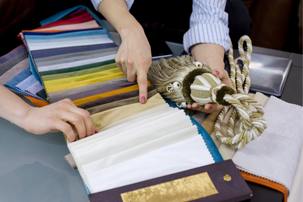
To further enhance the precision and effectiveness of colour choices, consider utilizing a colour specification service. These services provide expert guidance on selecting the perfect colour palettes for your interior design projects, ensuring that the chosen colours align with the desired mood and functionality of the space. This professional touch can make a significant difference in the overall impact and success of your design endeavours.
Colours can also play a functional role in interior design, helping to highlight or conceal certain features of a space. For example, if you have a beautiful architectural detail like a fireplace or accent wall, using a bold colour on that feature can help to draw attention to it and make it a focal point of the room. If you want your space to feel energetic and vibrant, you might choose bold, bright colours like red, orange, and yellow. On the other hand, if you want your space to feel calm and relaxing, you might choose softer, cooler colours like blue, green, and purple.
Conversely, if you have an unsightly feature like an exposed pipe or duct, using a similar colour on the walls and ceiling can help to visually blend it into the background and make it less noticeable. Colour can be used to create a cohesive and harmonious design scheme throughout a space that can make or break a space’s functionality and aesthetics. By using a consistent colour palette throughout a room or home, you can create a sense of unity and flow that makes the space feel well-designed and intentional.
Beyond emotional influence, color can visually shape a space. Light shades open up areas, creating an illusion of spaciousness, while dark colors add coziness and depth. By understanding these principles, interior designers can manipulate the perception of space, ensuring that a room serves its intended function while maintaining an aesthetic harmony.
To add a playful and retro pop art touch to your design, consider incorporating bold, vibrant colours like those commonly seen in pop art masterpieces. Think of the iconic reds, yellows, and blues often associated with this style. These colours can be strategically used as accents or even as primary elements in your colour scheme to infuse a sense of fun and nostalgia into your contemporary or Boho Chic design, creating a dynamic and visually engaging space.

Understanding the psychology of color and its cultural connotations is a designer’s arsenal. Each shade can have specific cultural meanings, which, when harnessed effectively, can resonate with occupants on a deep level. By considering cultural backgrounds and user preferences, designers can create spaces that are not only visually pleasing but also emotionally uplifting and functional.
In conclusion, the importance of colour in interior design is undeniable. It’s not just about making a space beautiful; it’s about harnessing the psychological and visual power of colour to create environments that engage our emotions, optimize functionality, and resonate with our cultural sensibilities. When wielded with skill and knowledge, the colour becomes a transformative force in the hands of a designer, ensuring that a space feels just right in every way.
When considering the application of colour in interior design, particularly in the context of an Art Deco restaurant design, it’s essential to grasp the significance of rich, bold colour choices and geometric patterns. Art Deco, known for its luxury and glamour, often incorporates vibrant hues, such as deep blues, golds, and reds, to create a visually striking and elegant ambience. The strategic use of colour in an Art Deco-inspired restaurant can transport patrons to a bygone era of sophistication and luxury, enhancing the overall dining experience.
Author : Deepika Kaushik and Gunjan Khemka (Interior Designer)