
“Design is thinking made visual.”
-Saul Bass
Decorating your home can be a delightful yet challenging endeavor. One of the key dilemmas homeowners face is how to strike the right balance between furniture and decoration without the help of interior designing services in London . The 60-30-10 rule, a well-established guideline in interior design, offers a structured approach to achieving harmony in your living spaces. In this blog, we’ll explore the 60-30-10 rule, breaking down its principles and providing practical insights on how to apply it to a beautifully balanced and visually appealing home.
Furniture
- For large furniture pieces such as sofas, 30% of other colors for secondary items such as chairs, and 10% of accent colors for smaller decorative items such as cushions or throws, use 60% of one dominant color.
Décor
- Decorative elements such as paintings, rugs and accessories shall be covered by this rule. To achieve an overall and balanced look, use 60 % of the dominant color in larger accent pieces, 30 % of the secondary color for medium sized objects or 10 % of the accent colors for smaller decorative accents.
Wall colors
- For small details such as moldings, doors frames and wall art, use 60 % for the main color of your walls, 30 % for trim or wainscoting plus 10 % for an accent color when selecting a paint scheme.
Window treatments
- Use 60% for the main color or shade, 30% for the color of blinds and shades as well as 10% for accent colors by means of tieback, trims & decorative curtain elements to apply this rule.
Bedding
- Use the rule of 60 % for main colors, 30 % secondary colors and 10 % accent color through decorative pillows, throws or bed skirt in bedding ensembles.
The 60-30-10 rule is a straightforward concept that divides your colour palette into 3 distinct percentages:
1. 60% Dominant Color:
This is the primary color that dominates your room’s overall look. It typically covers the walls, larger pieces of furniture selection services, and the base color of your décor. This color, which is usually applied to the walls, sets the overall tone and serves as the backdrop for the entire design scheme.
The predominant color choice usually has a great impact on the look of the room, making it feel coherent and unified in its various components. To create a strong visual base that will set the stage for other colors and accents to follow, you can select an important color which complements your chosen mood and style.
2. 30% Secondary Color:
This color serves as a complementary backdrop to the dominant color giving the visual composition a balanced and harmonious look. The depth and interest in the area can be added by selecting a secondary color, which may contrast or enhance the dominant color.
You can establish a coherent, harmonized beauty supporting the entire theme and feel of the room by adding this color to crucial design elements like furniture, rugs or drapes, larger pieces and bedding.
3. 10% Accent Color
An accent color, comprising 10% of the color palette, is a stimulating addition that brings personality and visual interest to the room. The accent color is your room’s pop of personality. It’s used sparingly for small décor items, throw pillows, artwork, and accessories, adding vibrancy and interest.
The choice of a contrast or complementing color between the primary and secondary hues may result in an atmosphere of dynamism and energy. In addition, you can highlight specific elements of the design and get a sense of equilibrium and liveliness within your entire color palette with strategic placement of complementary colors around the room.

Practical Examples of the 60-30-10 Rule
1. Living
Use a neutral color for 60% of the walls, a complementary color for 30% of the furniture, and vibrant accent pillows, throws, or artwork in an accent color for 10% of the decorative elements.
- Dominant Color (60%): Beige walls and a neutral sofa.
- Secondary Color (30%): Soft blue or green accents through curtains and an area rug.
- Accent Color (10%): Vibrant throw pillows, artwork, and decorative vases in bold yellow or orange.2. Bedroom Paint the walls with a calming color for 60%, select bedding and drapery in a coordinating shade for 30%, and add pops of a bold accent color through artwork and accessories selection like decorative cushions, rugs, or bedside accessories for the remaining 10%.
- Dominant Color (60%): Soft grey walls and a white bed.
- Secondary Color (30%): Subtle lavender or blush pink through bedding and curtains.
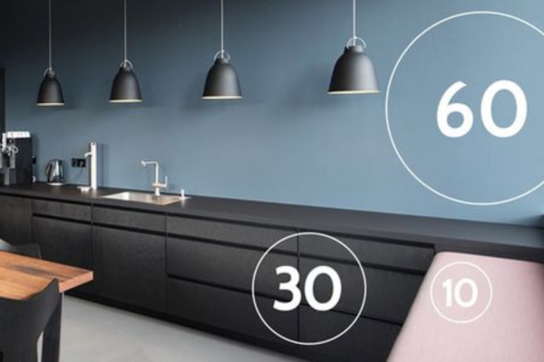
- Accent Color (10%): A pop of teal in decorative pillows and a small accent chair.3. Kitchen Choose a neutral color for 60% of the cabinetry and walls, opt for a contrasting hue for 30% of the countertops and backsplash, and introduce accent colors through kitchen accessories, decorative dishes, or a small indoor plant arrangement for the final 10%.
- Dominant Color (60%): Crisp white cabinetry and walls.
- Secondary Color (30%): Charcoal grey countertops and kitchen island.
- Accent Color (10%): Deep red or navy blue in dishware, curtains, and small appliances.4. Home OfficeIn a home office, employ the 60-30-10 rule by painting the walls with a calming hue for 60%, selecting furniture and drapery in a coordinating shade for 30%, and incorporating accent colors through desk accessories, artwork, or plants for the remaining 10%, fostering a balanced and inspiring work environment.
- Dominant Color (60%): Natural wood-tone furniture and flooring.
- Secondary Color (30%): A rich, forest green accent wall and office chair.
- Accent Color (10%): Bright gold or brass accents in desk accessories and lighting fixtures.

Advantages of the 60-30-10 Rule Principles
- Balance: For the purpose of creating a sense of visual balance and consistency, equilibrium is defined in Interior Design as strategic arrangement of design elements such as furnishings, colors, textures or lighting. This involves allocating visual weight equally in the entire space with a view to minimizing dominance of any individual element and creating an harmonious, aesthetically attractive environment.
- Color Harmony: To create a harmonious and visually pleasing environment, the strategic selection and coordination of colours is an important element in interior design. In order to obtain a balance, harmonious design that retains the sense of unity and beauty in this space, it is possible to take account of factors like complementary, equal or similar color schemes.
- Cohesion: The seamless integration of different elements to create a unified and visually consistent living space is the cohesion of the design. Alignment of colors, textures, patterns and styles shall be part of this process so as to create a harmonious and balanced environment where all components are complemented by one another in order to contribute to the cohesion and attractiveness of the atmosphere.
- Flexibility: The creation of flexible areas that can accommodate a variety of activities and evolving needs is the essence of flexibility in interior design. In order to allow the living environment to cope with changes in lifestyle preferences and needs for operational functionality, as well as promote long term usability and comfort, it also includes modular furniture that consists of a variety of different configuration elements such as multifunctional design elements or configurable layout.
- Visual Interest: The concept of visual interest in interior design refers to integrating diverse, fascinating elements that stimulate the senses and arouse curiosity. To create dynamic focal points and engaging visual experiences to stimulate a lively and entertaining living environment, the use of textures, patterns, colors or special design characteristics is also included.
- Easy Updates: The incorporation of elements that can be easily altered or replaced with a view to updating the look and feel of an area is part of easy updates in interior design. This allows for rapid and cost effective changes that allow the evolution of design trends and personal preference to be adapted, such as incorporating Removable Wallpapers, Interchangeable Accessories or Versatile Table Parts.
- Personalization: Careful selection of colors reflecting the style and preferences of individuals can be used to achieve this kind of personalization. In order to enhance the space with a distinctive touch which reflects their personality and creates an impression of warmth and individuality in the overall design scheme, it may be possible to combine personalized touches into 10% accent colors: for example artwork, decorative accessories or textiles.
- Professional Look: Following this guideline often results in a professionally curated appearance, and by personal shopper service, it will give the room a polished and well-designed aesthetic. A polished and sophisticated space can be created by incorporating the finest materials, precise design as well as a single color palette that brings out an feeling of professionalism and expertise.

The 60-30-10 rule is a valuable tool for achieving a well-balanced and visually appealing home. By carefully selecting your dominant, secondary, and accent colors, you can create a cohesive and harmonious color palette that suits your style and sets the desired mood for each room. Whether you prefer a serene and neutral oasis or a vibrant and lively space, this rule can be adapted to bring your interior design vision to life. So, embrace the 60-30-10 rule with Oraanj Interior Design, and watch as your home transforms into a beautifully balanced sanctuary of style and comfort.
Author: Yogita Sawarthia & Gayatri Joshi (Interior Designer)